
Sidekick
branding, ux/ui, research . interaction capstone

My final, and most extensive, design course at Northeastern was a thesis group design project. Over the course of two semesters, my two project partners and I researched, designed, and tested a mobile app to solve a personal struggle - planning literally anything with our friends. From our initial brainstorms in the classroom to user testing over zoom, we created a final branded prototype to solve an every day problem.
The first step in this 8 month process was to find real world problems that we were passionate about solving. We had such freedom with this course that I knew I wanted to balance the practical skills I had learned in school and the real experiences that are important to me. Everyone enjoys adventuring with friends, but when it comes down to actually planning those adventures, that’s where things get tough.
Not knowing exactly what our solution was going to be yet, my two partners and I started our research phase. We created a master research document where we collected articles, images, lists, links, stories, and anything else related to the topic as a form of competitive analysis research. This lengthy document became our guide as we started to narrow down our project focus. We then created a survey to send out to as many willing participants as possible.

One of our most important steps in our user research was conducting user interviewers. Not only did the interviews clearly showcase the problems users currently face, but sparked new ideas for possible solutions to help users tackle problems they didn’t even realize they were facing until we started asking more specific questions. With the findings from these interviews, we created journey maps and personas. The journey maps outlined those two large pain points (finding events you are actually interested in and trying to successfully plant an adventure with a group of people) and how those experiences would change if a helpful intervention was added to the experience. The personas helped us organize our users main needs while keepings us on track to finding a solution that would really work for them.

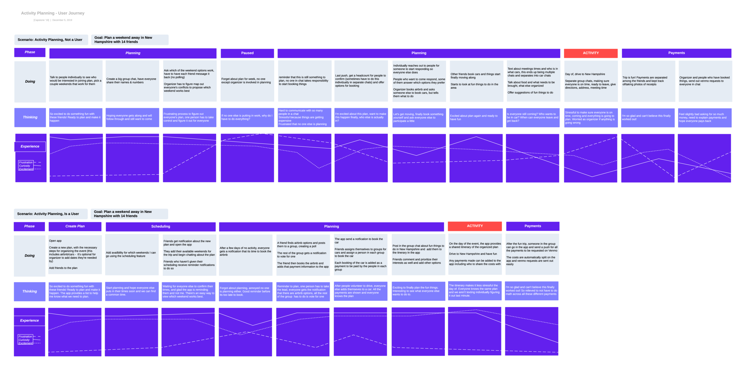

After this initial research phase we had these main takeaway:
Platforms like Facebook are too saturated with low quality events
Once you find events, its hard to actually plan them with your friends
Group chats are difficult to manage
Too many other apps involved (Google Cal, Venmo, FB)
Both, event finding and event planning, don’t currently exist in the same place, and while other event finding platforms do exist, through user testing we have discovered many problems with the process and no one is really happy with what they currently use.
Our proposed solution became Sidekick:
An app that has fewer quality events that are catered to you
Chat and update functions to help you plan activities with your friends and keep track of your planning process
Our next step was to really figure out the main structure and flow of the app. We made many versions of a site map trying to figure out how to actually connect the steps and tasks we wanted to user to be able to complete.

With our research driving our main outline for the application, we started on designing the low fidelity wireframes for Sidekick. We split up the main flows between the three of us and used Adobe XD to work collaboratively and simultaneously. This was crucial in a fully connected product because we had to over communicate to make sure each of our assigned portions of the wireframes were cohesive and functional across all flows and actions.
As the pandemic hit during our last semester of college, we continued the project from three different states across the country. We found that working along side each other over Facetime or “texting” directly onto the wireframes was the best way for us to communicate as clearly as possible.


As my teammates finished up our final rounds of user testings with our prototype, I transitioned focus onto the branding for Sidekick. One element that was important to us was creating an illustrated sidekick that could represent the platform. We went through rounds of brainstorming iconic sidekicks from history (some of our favorites being Mushu from Mulan and Clippy from Microsoft Word). We landed on the sidekick of a parrot as our mascot and I got to sketching. We sent out these four versions of a parrot to our classmates to get some critique on the main form of the bird.
After some valuable feedback from our peers we moved forward with Parrot C and I started to explore different color stories. I was trying to strike a balance between a friendly, excited, helpful parrot but one that was still mature enough for adults to connect with.

We landed on using both warm and cool colors to allow us the flexibility of using each individual color for different flows on the platform. With these main colors selected, our typefaces ready, we continued on to creating the high fi wireframes.

With the brand finalized, high fidelity wireframes completed, the first version of Sidekick was presented to our class over zoom in April of 2020! You can see a walkthrough of our screens in the video below or if you are curious what a final capstone presentation looks like over the internet you can view our recorded demo here.